
VARIOUS PROJECTS
✺
UX/UI & Web Design
Web Designer
Chatterkick.
Beth Trejo came to me requesting a complete overhaul of Chatterkick’s website, a social media agency offering full-service campaign management. Our initial meetings included discovery and strategy, where I mapped out every single page, broke down the project into 4 major phases, provided medium-fidelity wireframes, and finalized the site’s overall design system.
Each page is filled large amount of information accompanied with a clear call-to-action.

Main navigation map

wireframes created in adobe xd

THE SMALL DETAILS
Custom Features.
The new website was created with Wordpress using the Divi builder. Although this builder is extremely customizable, I used custom CSS to elevate the user-experience. Some custom features include a custom mega-menu, sidebar menus, portfolio pop-ups, and team member cards.


APP UX/UI (UNFINISHED)
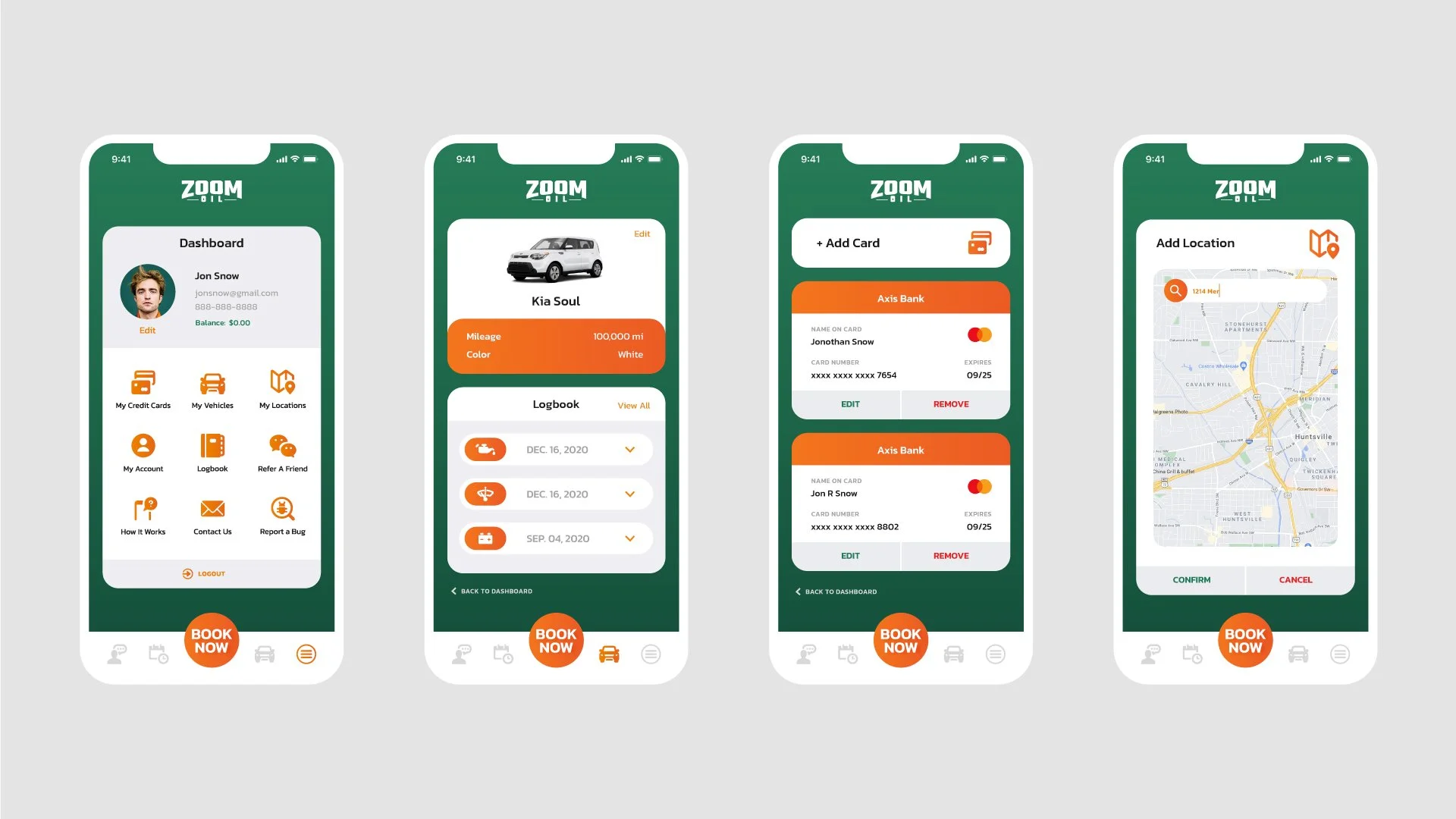
Zoom Oil.
Oil changes are inconvenient, but necessary to maintain the health of your car. Zoom Oil allows customers to book appointments and receive services at the comfort of their own home or workplace.
50+ screens were designed within Adobe XD before the project was shut down.
TASKS
App flow
Wireframe
Style Guide
Design all screens


UI Designer | Quick-Turnaround
Edgemesh.
I was challenged with taking a 50+ page word document, creating it into 3 extremely different designs for desktop, and delivering it in less than 12 hours.
The first design (left) utilizes a dark minimalistic layout filled with clean sans-serif headers, monospaced paragraph text, and gradient buttons.
The second design (center) combines friendliness with professionalism through bold typography, a monochrome color palette, and playful illustrations.
The third design (right) reaches for a younger audience through the use of trendy typography, geometric and organic shapes, and colorful gradients.
high-fidelity wireframe of design options 1, 2 & 3 (partial view)


PERSONAL PROJECT | #DAILYUI EXERCISE.
Horror Streaming App.
What started as a “Sign Up” #dailyui exercise, turned into a full home-screen design for an unnamed horror streaming app. I first researched Netflix and various designers on Dribbble to draw inspiration from. From my research, most streaming platforms feature 1-3 movies at the top and then break down available movies into different categories such as “Popular” and “New.”
Problem: Movie thumbnails are often busy, not consistent in color, and do not fit well in vertical format.
Solution: Create minimal-yet-unsettling thumbnails with the use of low-lit characters on a black background. With this method, the thumbnails can easily be resized for both vertical and horizontal formats.
Character icons by Icon Monekey on Creative Market